Aquasherry: A mingling of Verdin, Sirope, Miel, Agua, Azucar, Plastic bag, and 2 pairs of chicle pegado a mi copa
, Artworks by Clara Rojas
This photocard is mainly inspired by how a microscope reveals objects in greater detail through
magnification and cropping. The translucency,
glow, and vivid colors of the grouped glass pieces were interpreted from multiple angles to enhance their visual impact.
Aperire: Flowing and Blooming in uncertainity, Collection book for AFW, Jinwon Kim, 2024
Through her collection, she embodies the gradual inner journey of human depth, depicting pain, wandering, resilience, and rebirth in the end.
Among the many images, I aimed to select and arrange those that best conveyed her collection maximize the narrative behind each looks through every pages.
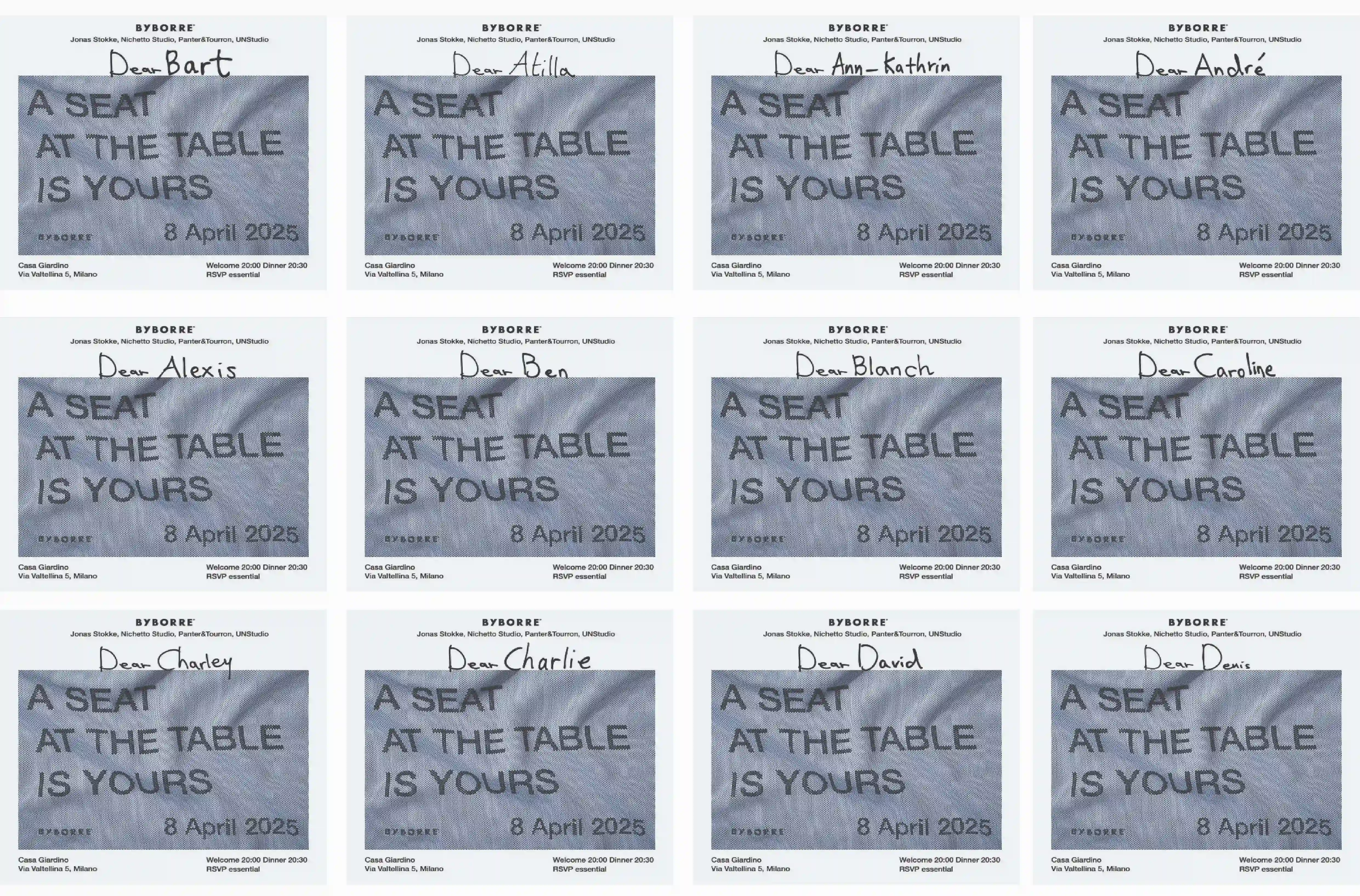
Creative direction and design an invitation for BYBORRE’s Milan Design Week dinner, 2025
Creatvie direction, film execution and design of an email invitation and menu for "Dinner with Love" by the Graphic Design Department GRA, 2023
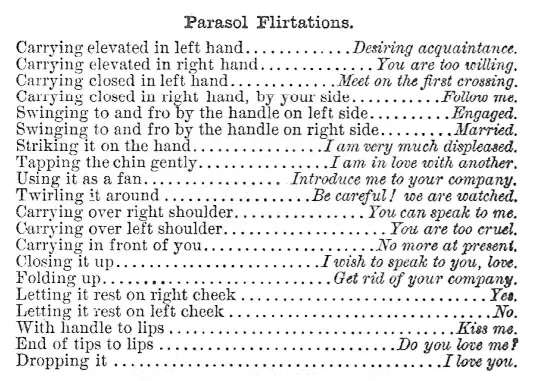
The invitation was designed around Rococo as the overarching theme of the dinner. Drawing inspiration from the parasols commonly carried by women during the Rococo period, this motif was incorporated as the central visual element of the invitation concept.
In front of the fire, creative direction and Photograph, Gel exhibition at GRA Amsteram, 2024
Why do we feel the urge to light a fire? What is it about fire that draws us in—holding our gaze and pulling us into quiet reflection?
As I sat watching a fire,
these questions began to surface.
In a world where so much of life has seamlessly shifted into the digital and virtual, I was drawn to people who now watch artificial fires—on screens, in stillness.
This project captures portraits of those moments: a reflection on our instinct to seek warmth, even in simulated light.
FF: Fake friendship, personal work, Image publication, 2023
is a photographic publication delving into dualistic and contradictory relationship between humans and whales.
Dynamically juxtaposing images and selective headlines from newspaper/article, the tension between dominance and companionship highlights
the duality in human attitudes towards animals in broader sense.
A logo for Mary Mary art institute in Seoul, 2024
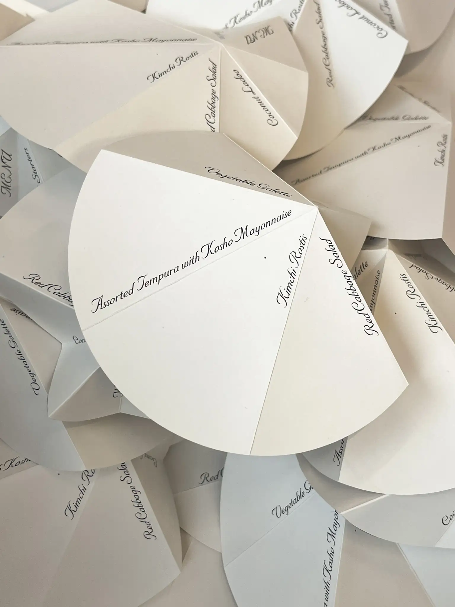
A menu and question card for the Nieuw Instituute Circle Dinner with BYBORRE, 2025
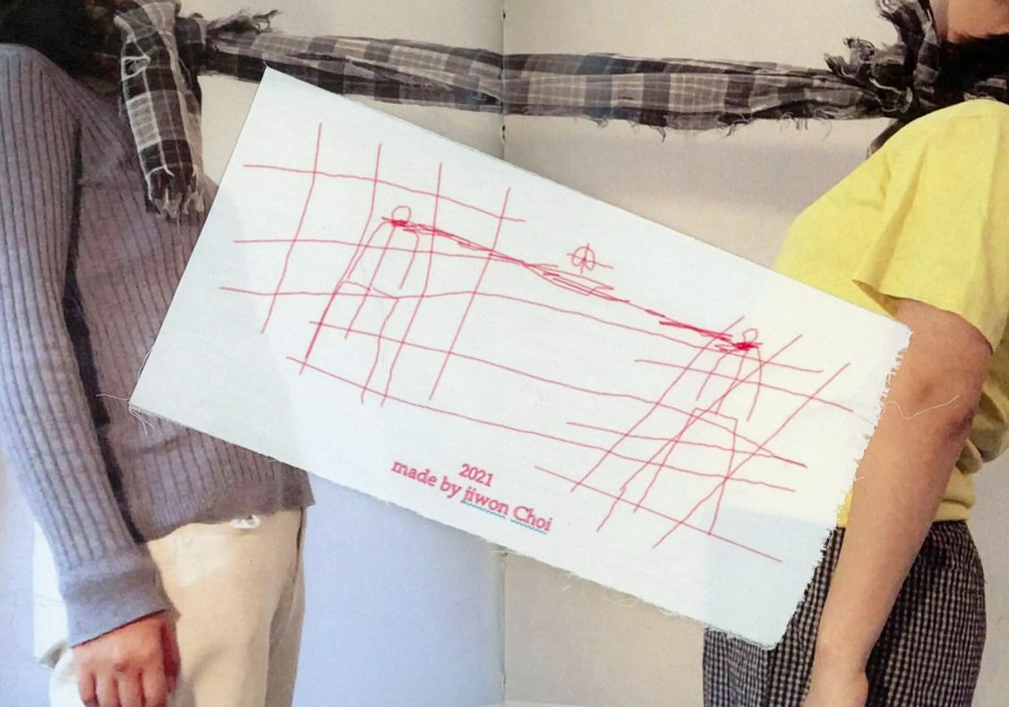
Creative direction and photograph for book S, Scarfs, 2021
S, Scarfs is a curated image book that explores the warmth and protection associated with the act of wearing a scarf, as well as the emotions and feelings it evokes. Additionally, it investigates the connections
and relationships that a scarf can create with people, along with its material qualities and forms.
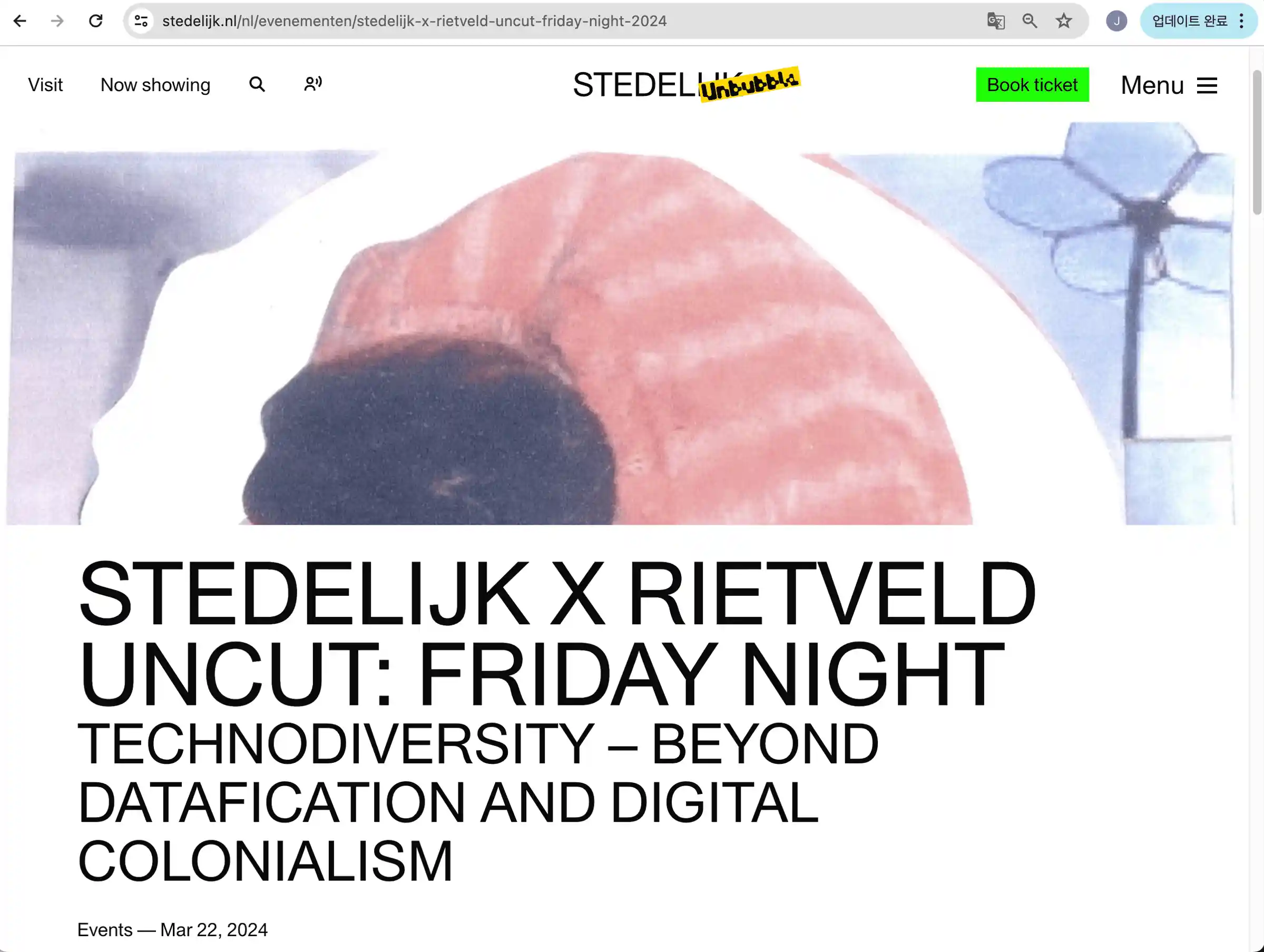
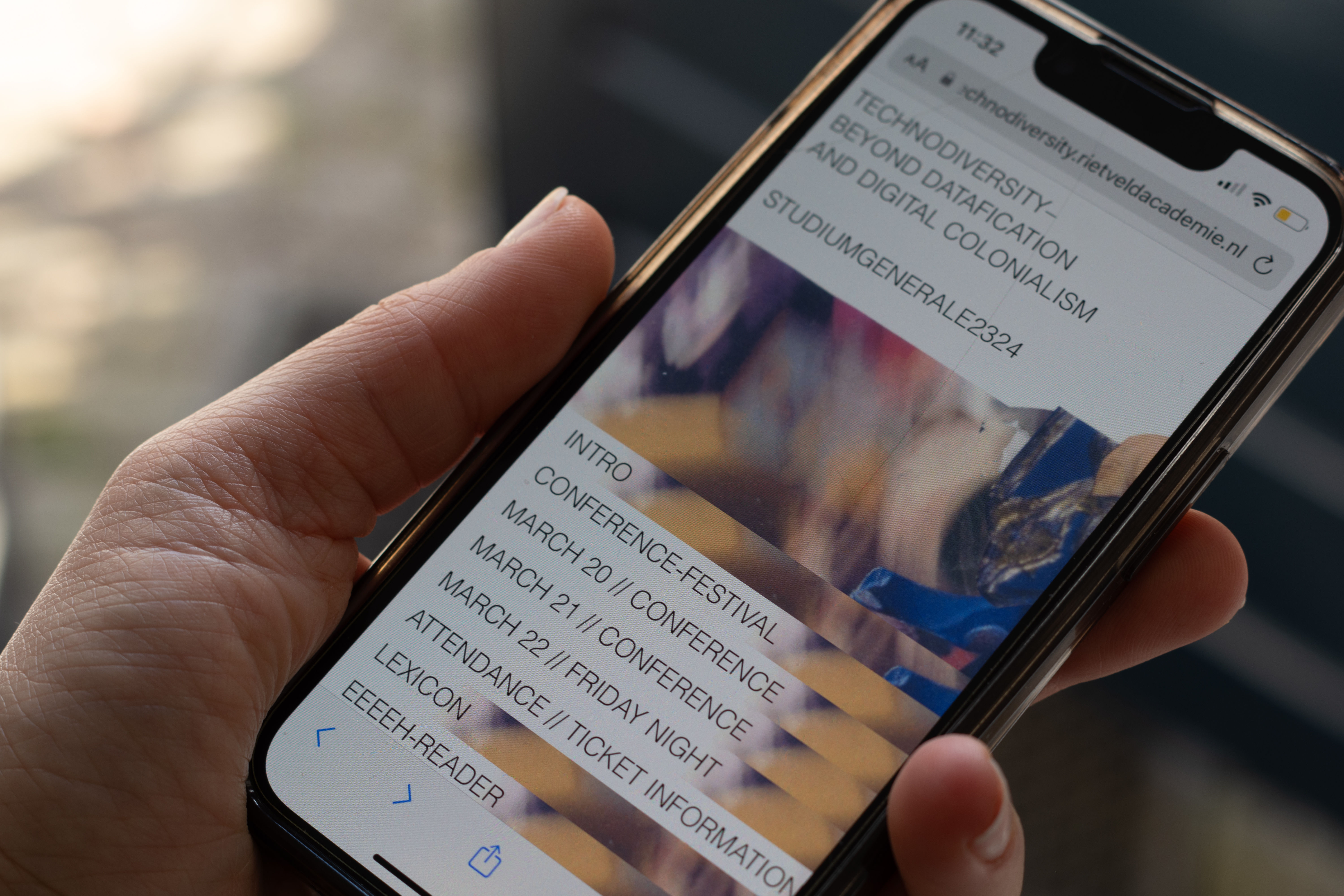
Website design, https://technodiversity.rietveldacademie.nl/rietveld-uncut, 2024
This is the final image 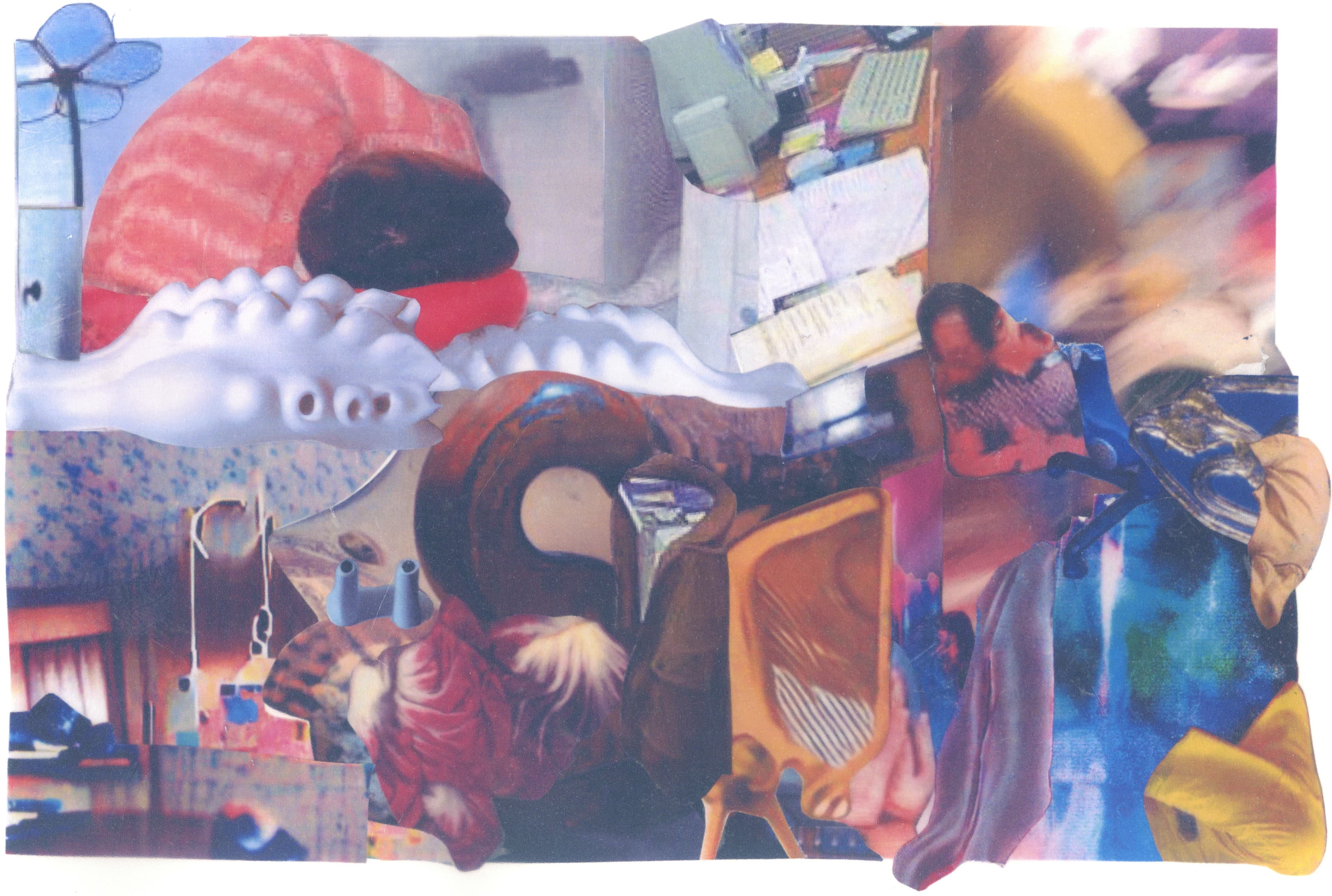
‘a picture that can’t name a single object.’ Using keywords from the event—such as AI, AFK, ghost in the machine, Technodiversity, etc.—we gathered
images broadly related to these topics and followed the method of early AI-generated pictures, where nothing in the image can be easily identified.
In a reverse approach, we aimed to mimic what AI once did, but created by our human hands.
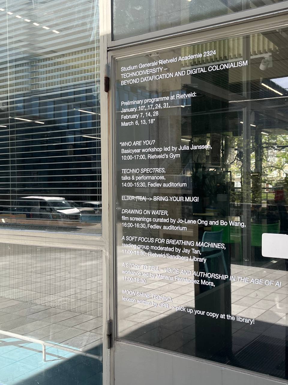
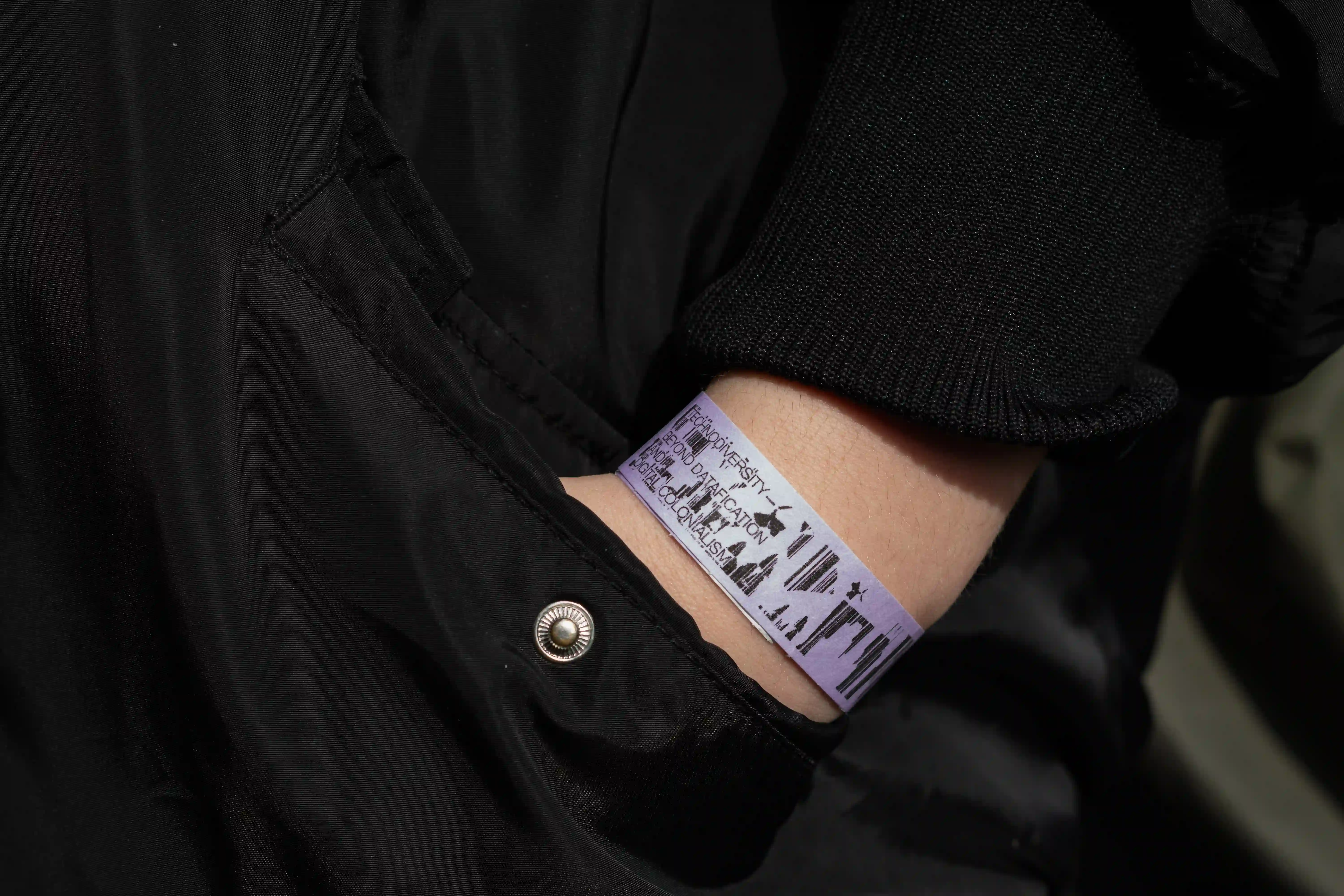
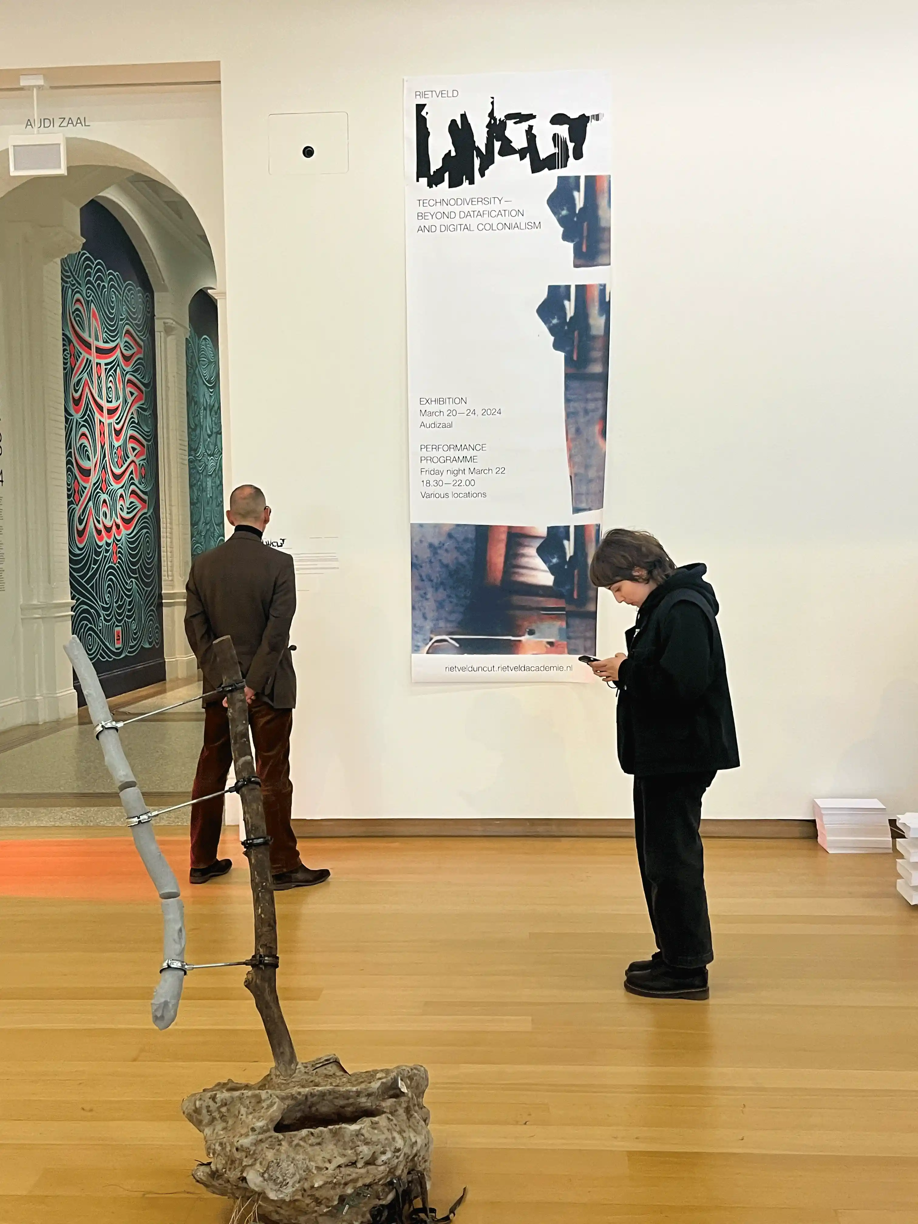
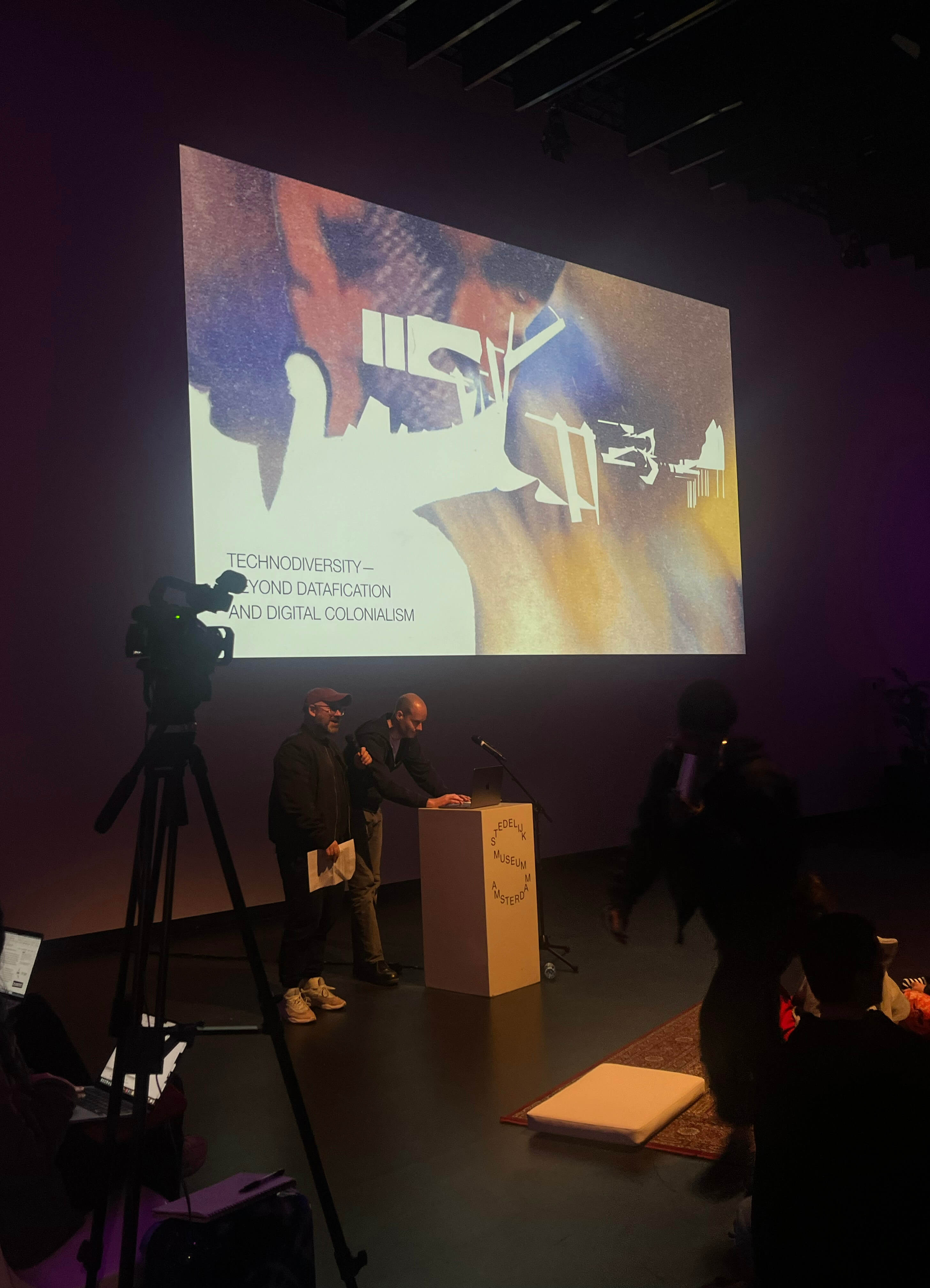
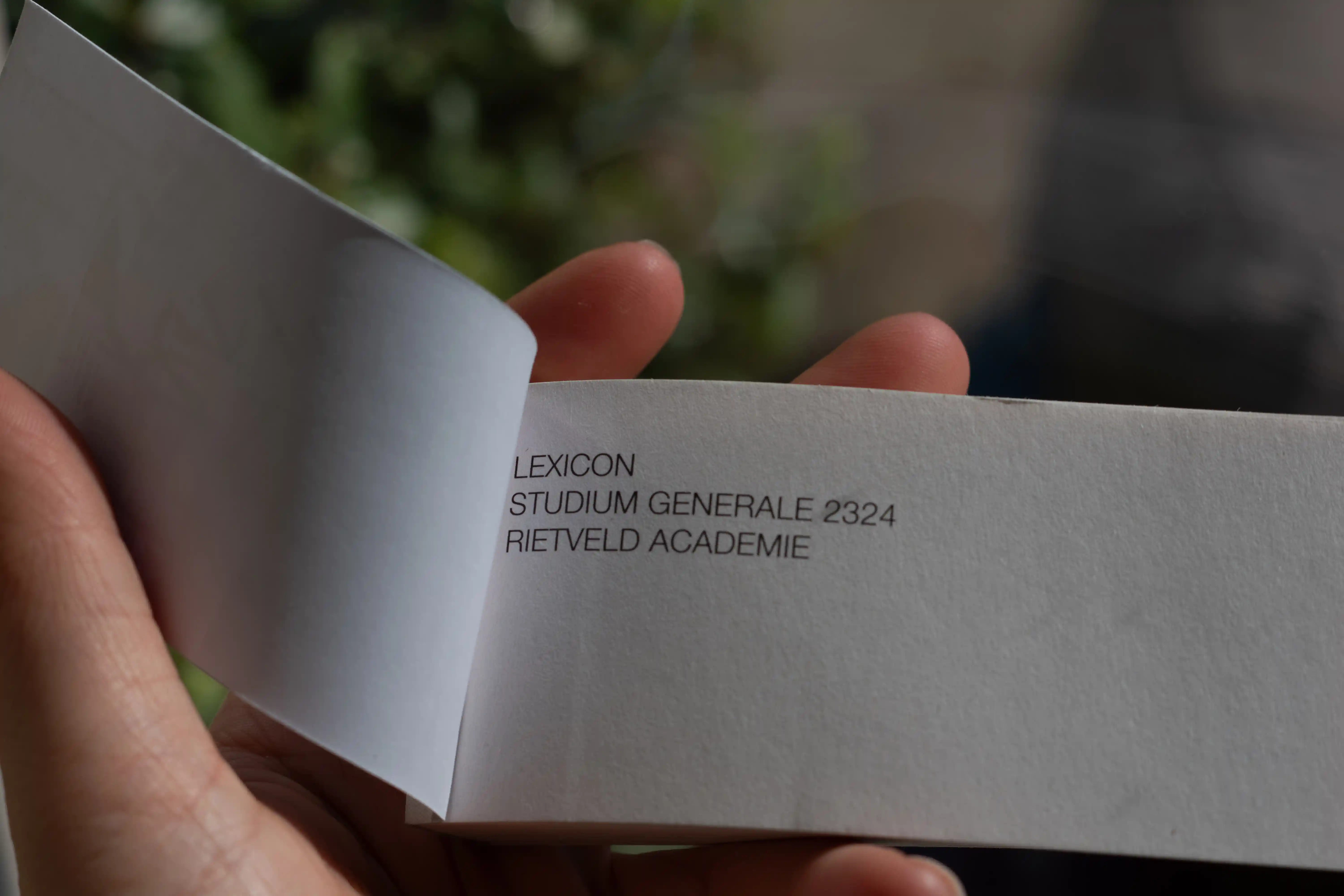
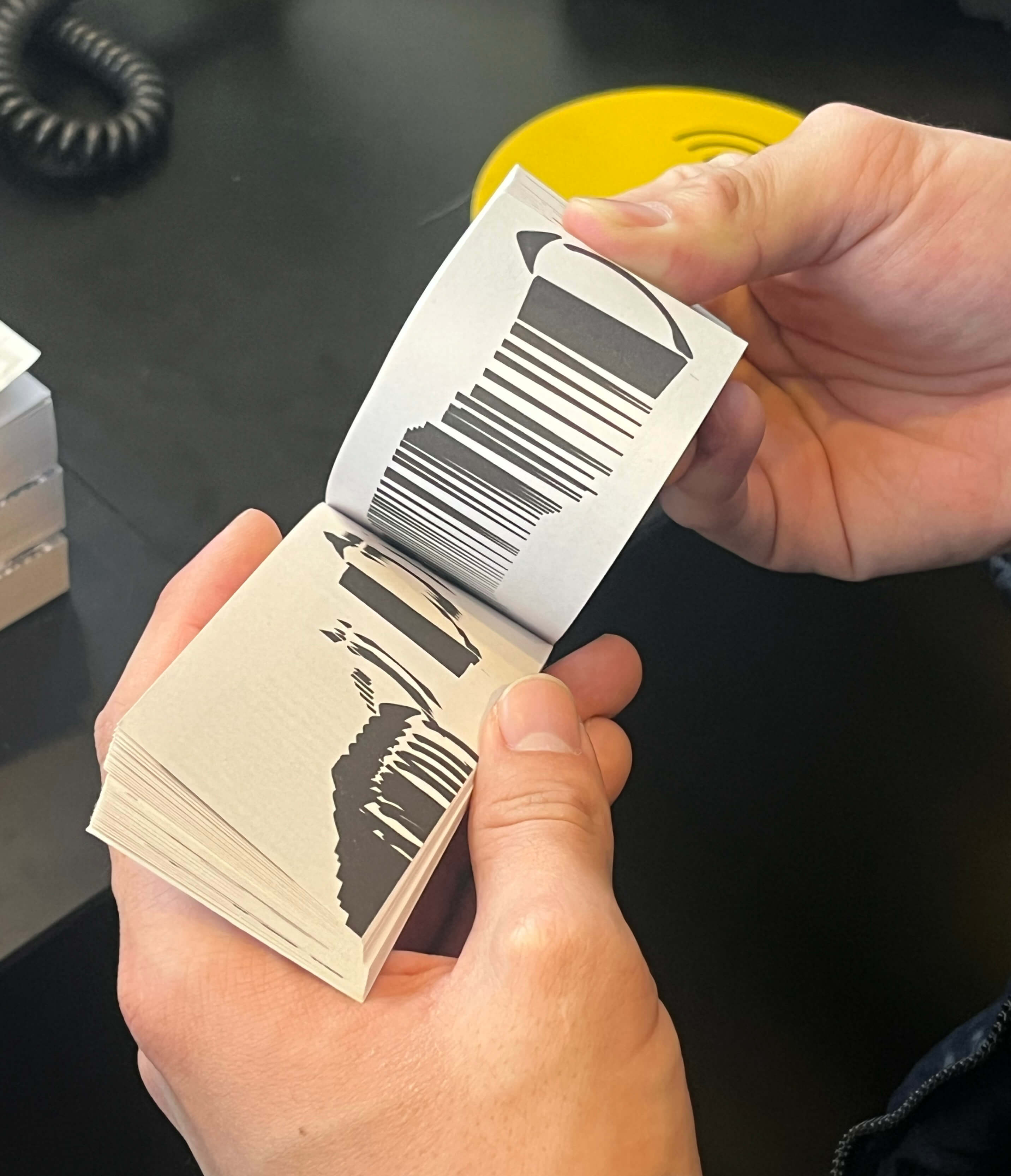
Identity for the Uncut Rietveld 2324 exhibition at the Stedelijk Museum in Amsterdam
The ‘UNCUT’ lettering, seen on the poster and D letter in the lexicon book, was made from paper scraps cut
from the first AI-inspired head image. Created by hand, the analog process naturally produced a visual glitch.
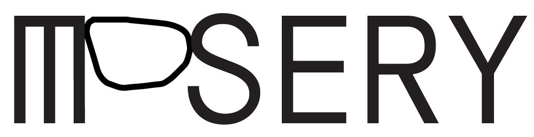
Visual identity for Mosery art studio in Seoul, 2025
Mosery Studio is a communal art space where people connect through art.
‘Mosery’ refers to the meeting point of two surfaces in Korean,
symbolizing interactions among individuals.
Inspired by a note artist wrote during a trip—A small but beautiful—Stones may seem smooth and uniform,
but each has its own unique shape— which emphasizes the organic connections formed when different people
come together, much like the unseen edges.
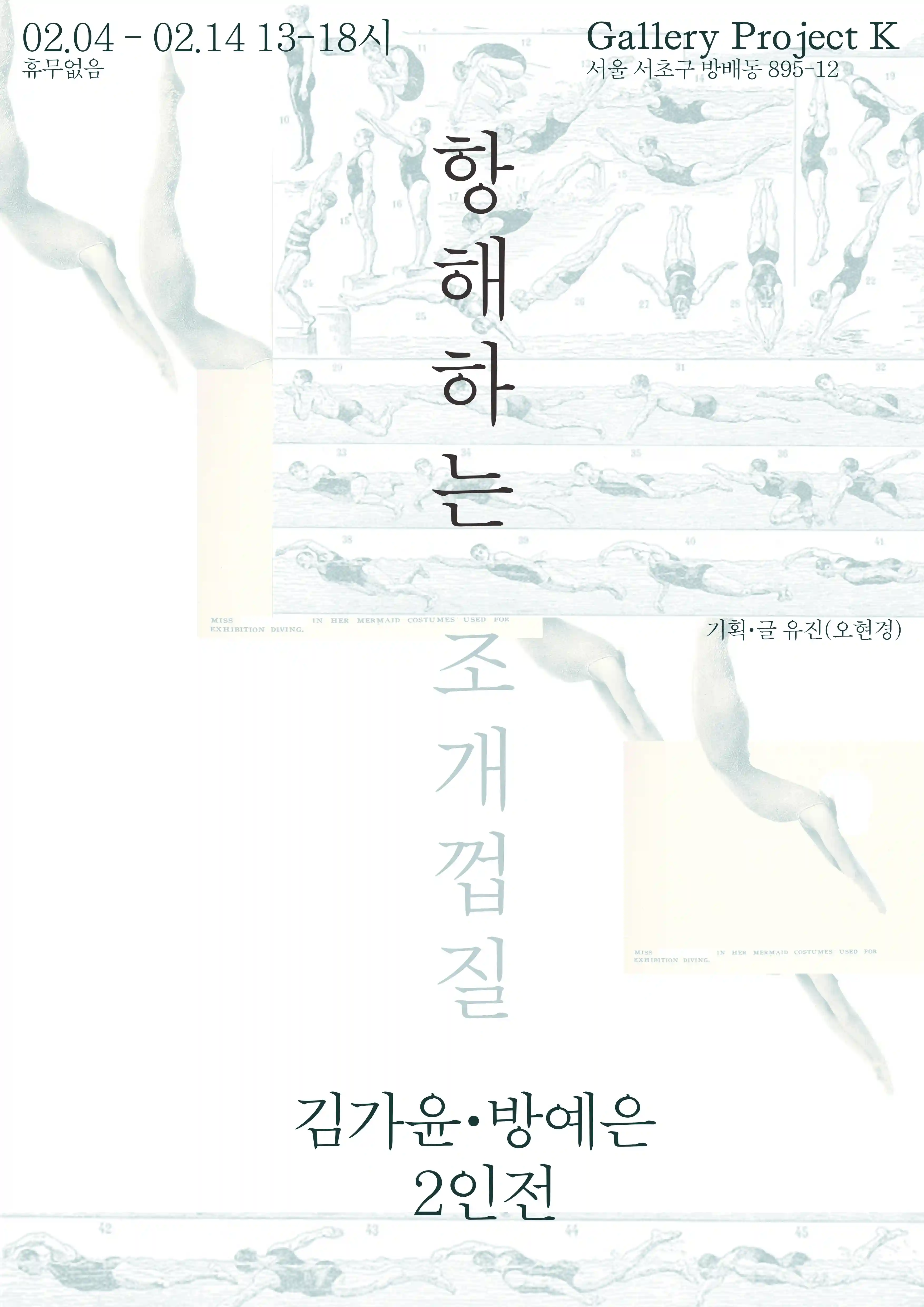
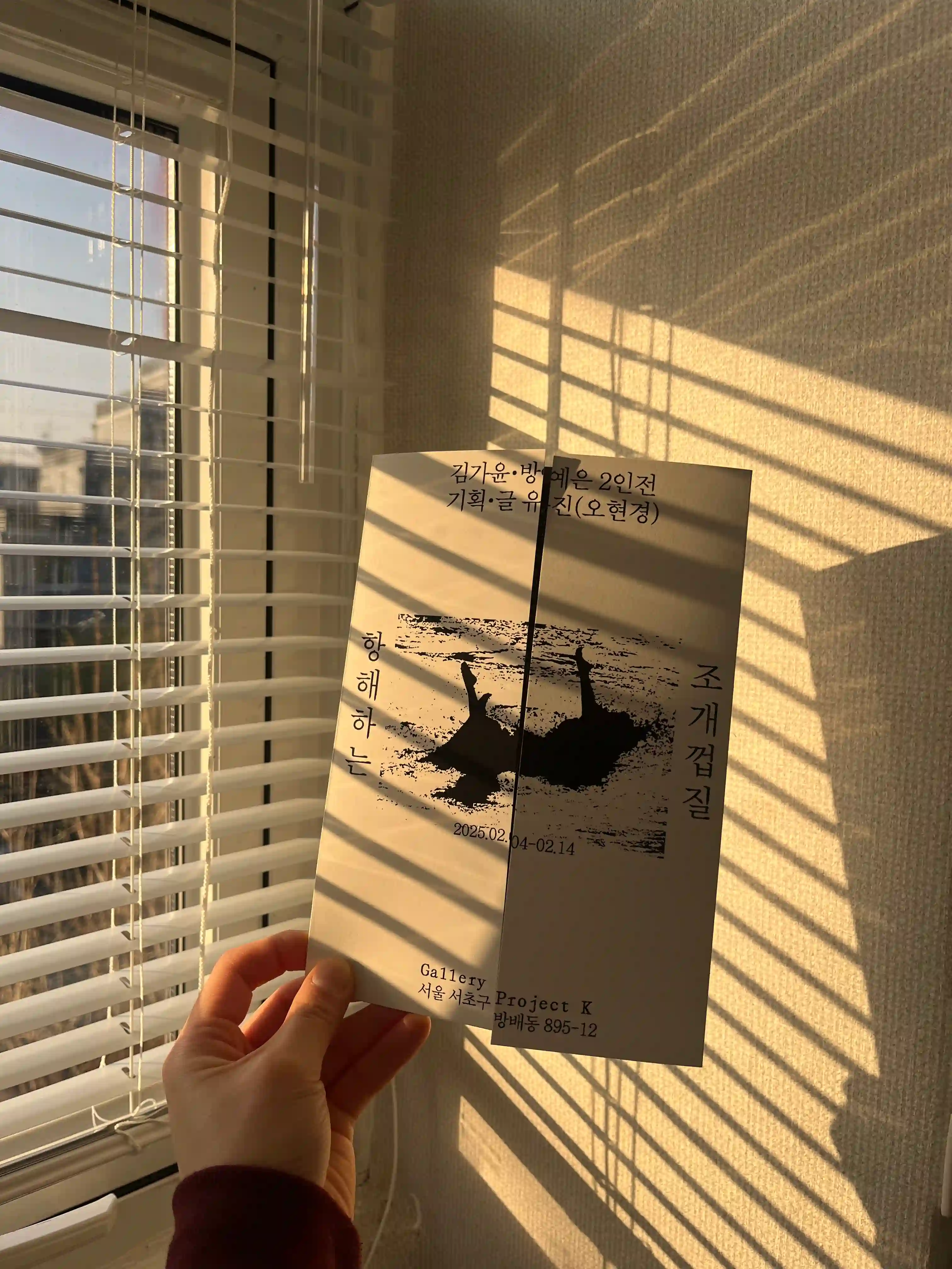
Design poster and leaflet for exhibition 항해하는 조개껍질, Seoul, 2025